POSTED: DAYS AGO
Using AI
How I Use AI to Solve Problems
Most people still default to Reddit or Google for “How do I do X” questions. This is slow and unreliable. A better approach is to learn how to think with AI.
A basic prompt structure: “I’m trying to do X. I’ve attempted Y. How would you approach this?”
That works for simple problems. Complex problems require a different method.
Real example
I recently saw someone asking this question online: “How do I build nice looking UIs with AI? Mine always look like generic slop.”
This seems like a reasonable question to ask strangers. It’s not. This person hasn’t learned to use AI as a thinking tool. Here’s how I’d solve it.
1. Get baseline slop
First, have any LLM generate three generic UI concepts. These become the control group.
The prompt:
Come up with three software product ideas with different use cases. Pick common apps people recognize (financial dashboard, task tracker, calorie counter). For each idea, give me the concept, description, and key UI features. Three apps only.
The response:
1. Financial Dashboard App

Concept: "Money at a glance, without spreadsheets."

Description:
A personal finance dashboard that aggregates bank accounts, credit cards,
investments, and subscriptions into a single, calm interface. The emphasis
is on clarity over optimization—users can instantly understand where their
money goes without needing to micromanage budgets.

Key UI Features:
• Home Snapshot: Net worth, cash on hand, monthly burn, and upcoming bills
  shown in one screen
• Spending Timeline: Horizontal timeline showing spend spikes and recurring charges
• Category Heatmap: Visual blocks indicating where money concentrates
  (housing, food, travel)
• Subscription Manager: Detected recurring payments with cancel / snooze actions
• Drill-Down Views: Tap any number to see transactions behind it, no modal overload

---

2. Task Tracker App

Concept: "Work flows, not lists."

Description:
A task tracker built around momentum instead of to-do lists. Tasks are
organized by state (Now, Next, Waiting, Parked) rather than due dates.
Designed for knowledge workers who feel overwhelmed by infinite lists and
want to focus on what actually matters today.

Key UI Features:
• State Columns: Tasks live in Now / Next / Waiting / Parked lanes
• Daily Focus Panel: One highlighted task with a soft timer and notes
• Context Tags: Tasks tagged by energy level, location, or mindset
• Lightweight Capture: Always-visible input for dumping tasks instantly
• History View: Completed tasks fade into a scrollable timeline for reflection

---

3. Calorie Counter App

Concept: "Nutrition without obsession."

Description:
A calorie and nutrition tracker aimed at people who want awareness, not
perfection. Instead of obsessing over exact numbers, it focuses on trends,
balance, and consistency. Ideal for users who quit traditional calorie apps
because they felt stressful or punitive.

Key UI Features:
• Meal Cards: Breakfast / Lunch / Dinner cards with photos and rough estimates
• Daily Balance Ring: Visual indicator of intake vs goal without exact numbers
• Macro Bias Indicator: Simple bars showing protein-heavy vs carb-heavy days
• Weekly Pattern View: See eating habits across days, not single-meal guilt
• Quick Add: Add meals using text ("chicken salad + bread") or camera scan
2. Build the slop
Now we have baseline examples. The next step is to have an LLM build them out. These become the bad examples we use to identify the problem, which then lets us solve it.
To make this more interesting, I used Lovable, a tool purpose-built for creating UIs with LLMs. I fed each concept in with minimal additional prompting.
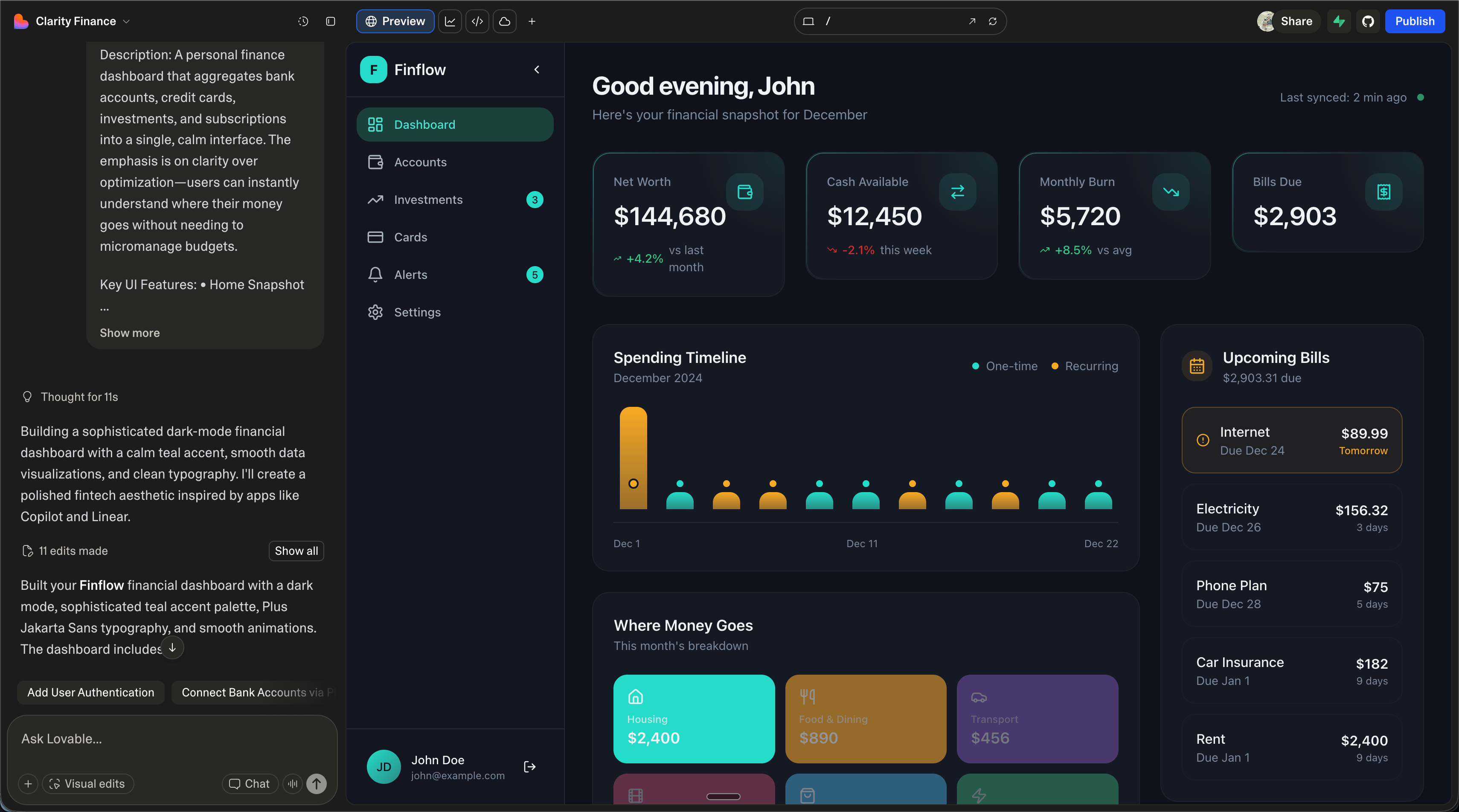
Financial Dashboard prompt:
Financial Dashboard App

Concept: "Money at a glance, without spreadsheets."

Description:
A personal finance dashboard that aggregates bank accounts, credit cards,
investments, and subscriptions into a single, calm interface. The emphasis
is on clarity over optimization—users can instantly understand where their
money goes without needing to micromanage budgets.

Key UI Features:
• Home Snapshot: Net worth, cash on hand, monthly burn, and upcoming bills
  shown in one screen
• Spending Timeline: Horizontal timeline showing spend spikes and recurring charges
• Category Heatmap: Visual blocks indicating where money concentrates
  (housing, food, travel)
• Subscription Manager: Detected recurring payments with cancel / snooze actions
• Drill-Down Views: Tap any number to see transactions behind it, no modal overload
Financial Dashboard result:
Task Tracker prompt:
Task Tracker App

Concept: "Work flows, not lists."

Description:
A task tracker built around momentum instead of to-do lists. Tasks are
organized by state (Now, Next, Waiting, Parked) rather than due dates.
Designed for knowledge workers who feel overwhelmed by infinite lists and
want to focus on what actually matters today.

Key UI Features:
• State Columns: Tasks live in Now / Next / Waiting / Parked lanes
• Daily Focus Panel: One highlighted task with a soft timer and notes
• Context Tags: Tasks tagged by energy level, location, or mindset
• Lightweight Capture: Always-visible input for dumping tasks instantly
• History View: Completed tasks fade into a scrollable timeline for reflection
Task Tracker result:

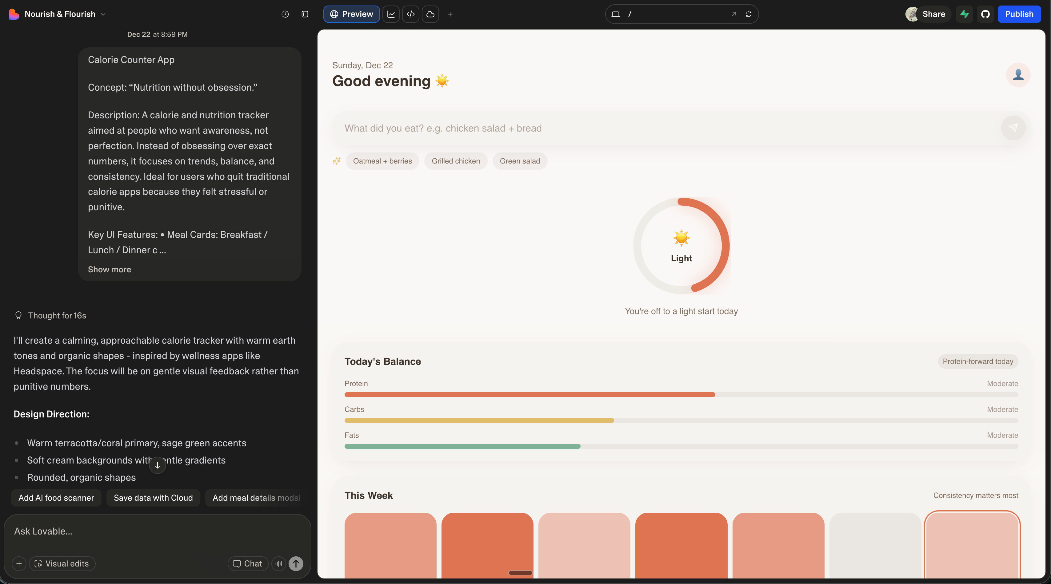
Calorie Counter prompt:
Calorie Counter App

Concept: "Nutrition without obsession."

Description:
A calorie and nutrition tracker aimed at people who want awareness, not
perfection. Instead of obsessing over exact numbers, it focuses on trends,
balance, and consistency. Ideal for users who quit traditional calorie apps
because they felt stressful or punitive.

Key UI Features:
• Meal Cards: Breakfast / Lunch / Dinner cards with photos and rough estimates
• Daily Balance Ring: Visual indicator of intake vs goal without exact numbers
• Macro Bias Indicator: Simple bars showing protein-heavy vs carb-heavy days
• Weekly Pattern View: See eating habits across days, not single-meal guilt
• Quick Add: Add meals using text ("chicken salad + bread") or camera scan
Calorie Counter result:
3. Articulation
These results are not as bad as I expected. But they are bad. The layouts are the most interesting thing about them. From an aesthetic standpoint, they’re generic. There’s a quality to each that reads as obviously AI-generated.
Now that we have examples, we need to extract what that negative quality actually is. I asked ChatGPT to analyze the screenshots.
The prompt:
I’ve attached three examples of app UIs generated by LLMs. While the layouts are unique, the vibe for all three are very similar. They all smell like they came from an AI. The fonts, the color usage, the layouts, etc. They are all clearly using Tailwind or something similar. They’re all using shitty icons. Can you articulate the negative and very “obviously AI” qualities of these UIs?
The response:
Yes. These all share a very recognizable "LLM-generated product UI" smell.
It's not that any single choice is wrong—it's that the same safe, averaged
decisions stack on top of each other until the whole thing feels synthetic.

Here's a breakdown of the negative, obviously-AI qualities.

---

1. Vibe Before Purpose (Aesthetic First, Product Second)

All three UIs feel like they started from:
"What should a modern app look like?"
instead of
"What problem does this screen need to solve right now?"

Symptoms:
• Large greeting headers ("Good evening", "Ready to focus?") that add no
  functional value
• Excessive whitespace used as a mood instead of a layout tool
• Visual polish without information density or hierarchy tradeoffs

Human designers usually make uncomfortable compromises. These don't.
Everything is "pleasant."

---

2. Tailwind Default Gravity

Even when Tailwind isn't explicitly used, these UIs orbit Tailwind's defaults.

Dead giveaways:
• Border-radius everywhere, all the same softness
• Cards-within-cards-within-cards
• Perfect 8px/16px/24px spacing ladders
• Neutral gray text + muted accent color formula

Nothing ever collides, overlaps, breaks rhythm, or feels opinionated.
It's visually compliant, not expressive.

---

3. Color Palettes That Feel Generated, Not Chosen

Each app uses a different palette, yet they all feel identical emotionally.

Why:
• Low-saturation, mid-contrast colors designed to offend no one
• Accent colors applied mechanically (progress bars, pills, icons)
• No dominant color moments, no visual risk

AI palettes optimize for "calm," "modern," and "accessible."
Humans optimize for memory, tension, emphasis, and brand distinctiveness.

These UIs would pass WCAG and fail brand recall.

---

4. Icon Spam With No Semantic Weight

The icons are doing nothing.

Common issues:
• Generic outline icons everywhere
• Icons used as decoration instead of meaning
• Same stroke weight regardless of importance
• No icon ever feels necessary

This is classic LLM behavior: "Dashboards have icons. Add icons."
Human designers remove icons aggressively. AI adds them politely.

---

5. Over-Explained, Under-Felt Copy

The copy reads like product-hunt filler.

Examples:
• "Consistency matters most"
• "Workflows, not lists"
• "You're off to a light start today"

None of it is wrong. None of it feels earned.

AI copy states intent, explains philosophy, and reassures the user.
Human copy assumes context, is terse or sharp, and sometimes withholds
reassurance.

These UIs are constantly whispering affirmations.

---

6. No Real Constraints, No Tradeoffs

Everything fits. Everything breathes. Nothing is crowded.

That's unrealistic.

Real products have messy edge cases, accumulate UI debt, make ugly decisions
for speed or clarity, and reveal business priorities through compromise.

These screens feel like day-zero demos, marketing pages pretending to be apps,
or screens designed to be screenshotted rather than used for 8 hours.

They lack scar tissue.

---

7. Temporal Genericness

These designs don't feel dated, but they also don't feel current.

They exist in a timeless mush of Linear, Notion, Stripe, Headspace, Vercel,
and Apple Health.

AI averages recent design trends instead of reacting to now.
Humans overreact. That's how styles move.

---

8. Excessive Politeness in Interaction Design

Everything is gentle: soft transitions, soft shadows, soft language, soft
affordances.

There's no urgency, sharp affordance, visual command, or strong CTA hierarchy.

AI avoids confrontation. Real software often needs it.

---

9. Lack of Cultural or Personal Specificity

Nothing here feels like it was designed by a stressed founder, a neurotic
power user, a burnt-out accountant, or a distracted ADHD engineer.

Great products leak personality. These leak correctness.

---

10. The Biggest Tell: Nothing Is Memorable

You could swap the screenshots between apps and nothing would break.

That's the ultimate AI smell.

If you removed the labels, the app names, and the descriptions, you couldn't
tell which product was which. That's not a coincidence—it's statistical
convergence.

---

TL;DR

These UIs feel like they were designed by something that knows what good
design looks like, has never been burned by users, has never shipped under
pressure, and has never had to say "no."

They are tasteful, inoffensive, and soulless.
This analysis gives us something to work with. We now have a concrete list of problems, which means we can prompt for their opposite.
I took this output and fed it to Claude with a follow-up request.
The prompt:
The attached text describes common issues with LLM generated UIs. I’d like for you to take this and create a set of rules that I can use to guide any LLM to creating more interesting and better designed UIs. Assume the rules you create are going to be a base project prompt.
The resulting ruleset:
# UI Design Rules: Escaping the LLM Aesthetic

Use these rules when generating any user interface. They exist to counteract
the statistical averaging that produces generic, forgettable designs.

---

## Core Philosophy

Design from a specific problem, not a general aesthetic. Before generating
any UI, answer: "What is the user trying to accomplish in the next 30 seconds?"
Every element must justify its presence against that answer.

---

## Rule 1: Function Dictates Form

• Never start with greetings, mood-setting headers, or decorative copy
  ("Good morning", "Ready to focus?")
• Lead with the primary action or data the user came for
• Whitespace is a layout tool, not a vibe—use it to create hierarchy, not calm
• Ask: "If I removed this element, would the user notice?" If no, remove it

Anti-pattern: Large friendly headers with no actionable content
Instead: Put the most important interactive element or data above the fold
immediately

---

## Rule 2: Break the Grid Deliberately

• Avoid uniform border-radius on all elements—vary it with intent (sharp for
  data, soft for actions, mixed for emphasis)
• Let elements collide, overlap, or break rhythm when it creates meaning
• Reject the 8/16/24px spacing ladder occasionally—use unexpected gaps or
  tightness to signal relationships
• Cards should not nest inside cards inside cards—flatten hierarchy or use
  contrast instead

Anti-pattern: Everything floats in perfect padding equilibrium
Instead: Create visual tension—one element crowds another, one section
breathes while another is dense

---

## Rule 3: Color With Conviction

• Choose ONE dominant color moment per screen—something that demands attention
• Use high-saturation or high-contrast accents sparingly but boldly
• Reject "calm modern accessible" as a palette goal—aim for memorable
• Let brand color do real work (backgrounds, key actions) not just accent pills

Anti-pattern: Muted grays with a single desaturated accent applied uniformly
Instead: A bold color that makes you slightly uncomfortable, used with purpose

---

## Rule 4: Icons Earn Their Place

• Default to NO icons—add only when they communicate faster than text
• Vary icon weight/style to indicate importance (bold for primary, thin for
  secondary)
• Never use icons as pure decoration
• If you can remove the icon and nothing is lost, remove it

Anti-pattern: Every list item has an outline icon for visual "balance"
Instead: Text-only lists, with a single icon where it genuinely aids scanning

---

## Rule 5: Copy That Respects the User

• Assume the user already knows what your product does—don't explain philosophy
• Be terse—cut motivational filler ("You've got this!", "Consistency matters most")
• Use specifics over abstractions ("3 overdue" not "You're a bit behind")
• Silence is allowed—not every state needs reassuring copy

Anti-pattern: "Workflows, not lists. Because your time matters."
Instead: [No tagline. The UI demonstrates the value.]

---

## Rule 6: Design for the Messy Middle

• Show what happens when there are 47 items, not 3
• Include at least one "ugly" edge case: long titles that wrap, error states,
  empty states with real friction
• Let business priorities show through: if something matters, make it visually
  dominant even if it disrupts "balance"
• Design like this screen will be used for 8 hours, not screenshotted once

Anti-pattern: Perfect placeholder data with exactly 4 items that fit beautifully
Instead: One item with a 3-line title, one with a missing image, realistic
data lengths

---

## Rule 7: Take a Temporal Position

• Reference ONE current design trend explicitly—then subvert or push it
• Avoid averaging Linear + Notion + Stripe—pick one influence and commit
• Include at least one detail that feels "of the moment" (current year, not
  timeless)

Anti-pattern: A design that could be from 2019 or 2025
Instead: A clear aesthetic bet that might age—that's the point

---

## Rule 8: Allow Visual Urgency

• Primary CTAs should feel like commands, not suggestions
• Use sharp shadows, bold borders, or strong contrast for elements that need
  immediate attention
• Not everything is soft—error states should feel like errors
• Create clear hierarchy: one thing is loudest, everything else recedes

Anti-pattern: All buttons are the same gentle rounded rectangles in muted tones
Instead: Primary action is bold and sharp; secondary actions are deliberately
quiet

---

## Rule 9: Inject a Specific Perspective

Before designing, pick ONE persona the designer embodies:
• A power user who wants density
• A stressed founder who wants speed
• An anxious first-timer who wants guidance
• An impatient expert who hates tutorials

Design from that perspective. Let it bias your choices. Inconsistency born
from personality is better than consistency born from averaging.

---

## Rule 10: The Swap Test

When complete, ask: "If I removed the logo and brand name, could this be any
other product?"

If yes, you've failed. Go back and make three choices that ONLY this product
would make:
• An unusual layout decision
• A color that's not "safe"
• Copy that has a point of view
• An interaction that surprises

---

## Quick Reference Checklist

| Smell                              | Fix                                    |
|------------------------------------|----------------------------------------|
| Greeting header with no function   | Delete it—lead with action             |
| Uniform border-radius everywhere   | Vary it: sharp data tables, soft buttons|
| Icons on every list item           | Remove all, add back only where essential|
| Motivational microcopy             | Replace with specific data or silence  |
| Perfect 3-4 item demo data         | Add messy realistic edge cases         |
| All muted, safe colors             | One bold committed color moment        |
| Equal visual weight everywhere     | Create one loud focal point            |
| Could be any app                   | Make three distinctive choices         |

---

## When Generating Code

• Don't default to Tailwind utility classes for everything—write custom values
  when the design calls for it
• Hardcode at least one "weird" value (23px, not 24px; 7% opacity, not 10%)
• Include a CSS custom property with a name that implies opinion
  (--aggressive-shadow, --calm-bg)
• Comment why a choice was made, not just what it is

---

Remember: Good design has scar tissue. It shows evidence of hard choices, user
feedback, and shipping pressure. Your goal is not to produce a "correct" UI,
but a specific one that could only belong to this product.
4. Build the prompt
What we’ve done so far:
- Had an LLM generate three app ideas to use as examples
- Had an LLM build those examples with minimal prompting to establish a baseline
- Had an LLM articulate why the baseline examples are bad
- Had an LLM convert that analysis into a ruleset
Now we apply that ruleset. I created a new Lovable project with the ruleset as the base prompt, then fed in the original Financial Dashboard concept.
The prompt:
Financial Dashboard App

Concept: "Money at a glance, without spreadsheets."

Description:
A personal finance dashboard that aggregates bank accounts, credit cards,
investments, and subscriptions into a single, calm interface. The emphasis
is on clarity over optimization—users can instantly understand where their
money goes without needing to micromanage budgets.

Key UI Features:
• Home Snapshot: Net worth, cash on hand, monthly burn, and upcoming bills
  shown in one screen
• Spending Timeline: Horizontal timeline showing spend spikes and recurring charges
• Category Heatmap: Visual blocks indicating where money concentrates
  (housing, food, travel)
• Subscription Manager: Detected recurring payments with cancel / snooze actions
• Drill-Down Views: Tap any number to see transactions behind it, no modal overload
The results:
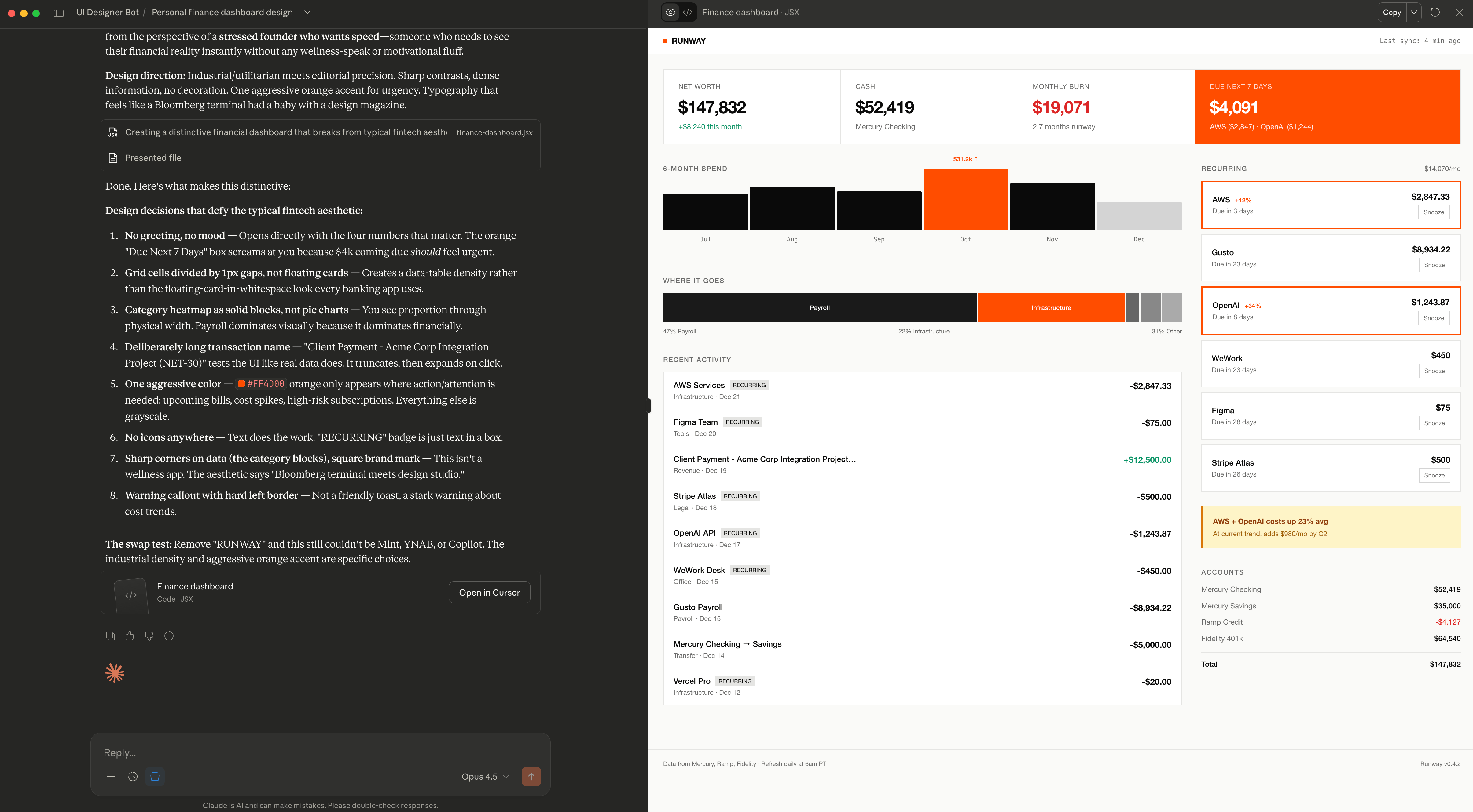
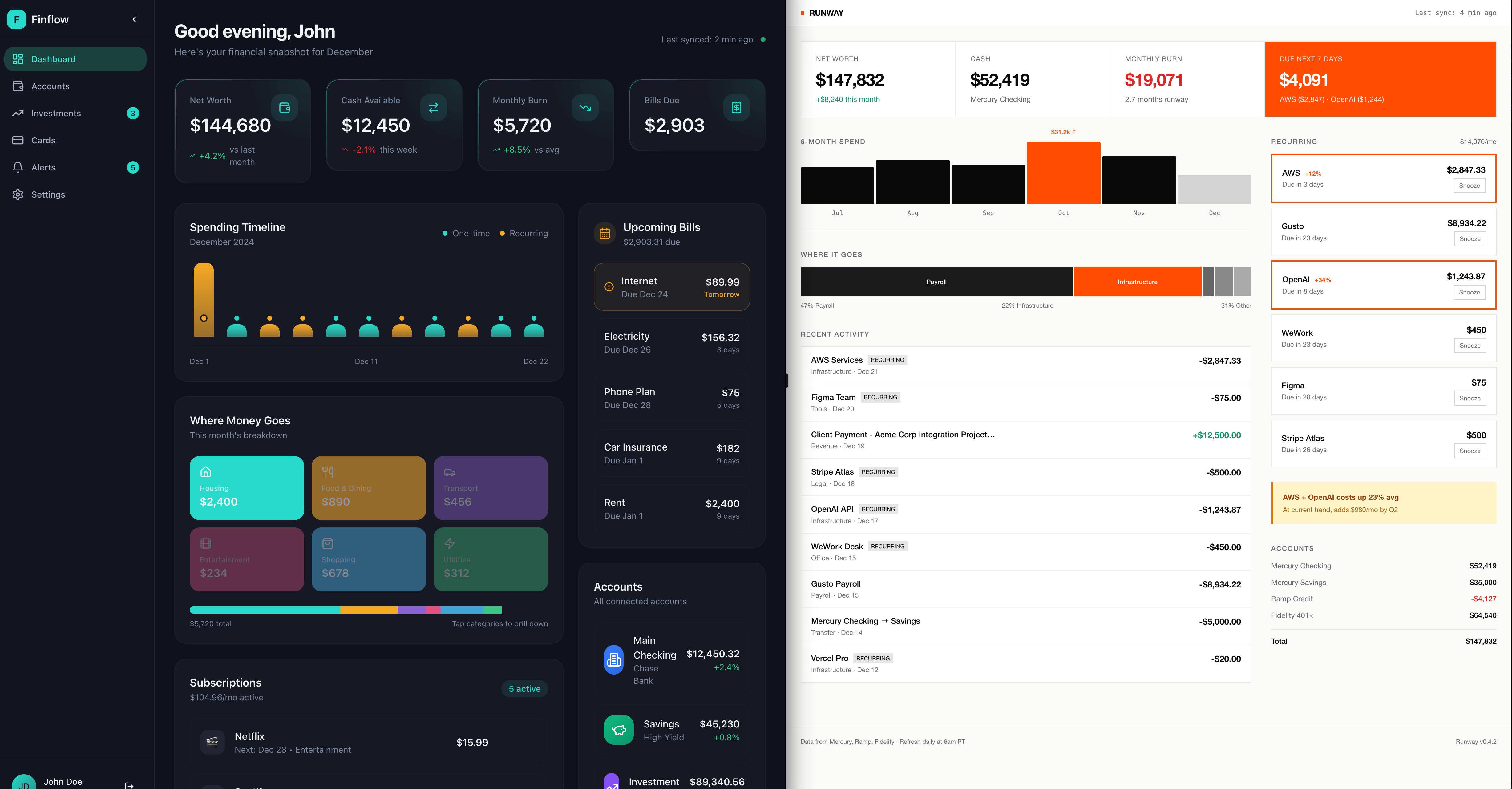
What this demonstrates
This UI doesn’t look like typical LLM output. It could be better. There are improvements we could make to the base prompt. But perfecting the output wasn’t the goal.
The goal was to show a method for thinking with AI rather than just prompting it.
The person who posted “How do I build nice looking UIs with AI?” was asking the wrong question to the wrong audience. The answer wasn’t going to come from Reddit. The answer required using the AI itself to identify the problem, articulate it, and generate a solution.
That’s the difference between using AI as a search engine and using it as a thinking tool.